Good for Nothing
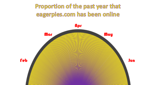
For our 1 year anniversary lets look at how we can make something out of nothing?
(more...)

For our 1 year anniversary lets look at how we can make something out of nothing?
(more...)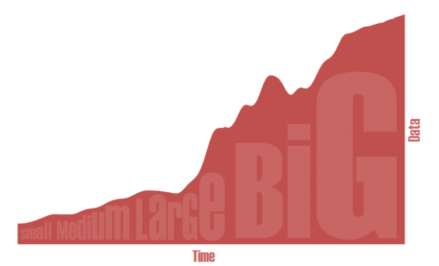
When navigating Big Data’s oleaginous seas, we rely on visualization to reveal its shimmering rainbows of insight. But how do we effectively convey all those details?
(more...)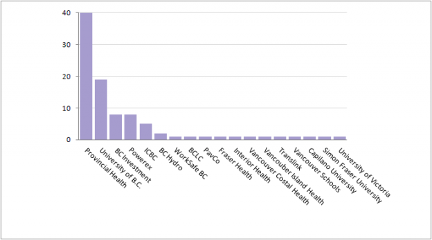
What are some simple steps that we can take to make our bar charts more engaging?
(more...)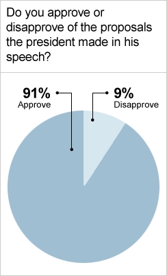
Back in Jan 2011 CBS produced this classy pie chart, in the wake of the President’s State of the Union speech that year, which boils things down to the essentials. But what could CBS have done to make this chart even better?
(more...)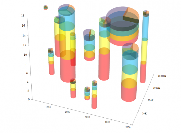
Charles Joseph Minard’s pioneering and bounteous use of pie charts has always been inspirational. It is no small wonder then that his work is so often cited in the visualization community. Can we do better than him?
(more...)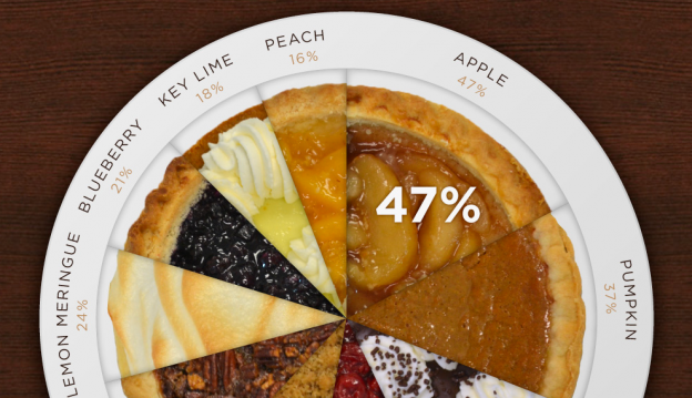
What better way to start our journey into pie than with the incredibly witty and original idea of making a pie chart with pies.
(more...)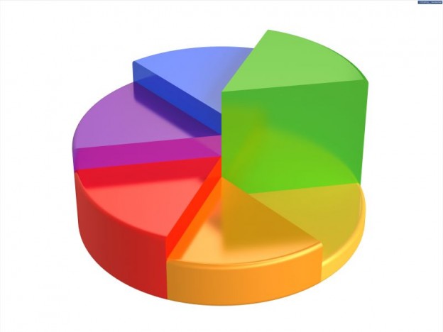
Visualization is the visual communication of information, and there is one form that communicates more precisely, effectively, efficiently, engagingly, and creatively than all others. This site is devoted to the most versatile, robust and wonderful of all information visualization mechanisms: the pie chart.
(more...)