If you’ve been keeping up with your visualization feeds and tweets you are probably aware of Stephen Few’s Tableau 8 critique and the subsequent debate between Few and Chad Skelton of the Vancouver Sun. Few makes it clear that he feels packed bubble visualizations are an abomination while Skelton maintains bar charts are jejune.
As an exercise, lets see if we can leopard crawl our way to the middle ground and mold from it’s fertile soils a representation of the data that is more captivating than the sedate bar chart without fabricating new data or wading into the bubbled waters of Skelton’s graph.
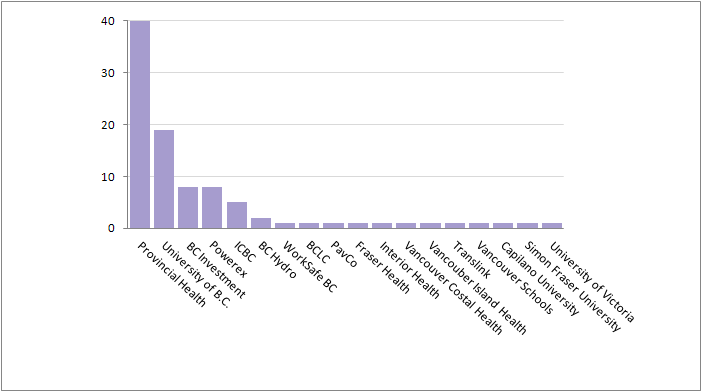
So here is Skelton’s data and the resultant bar chart that he labeled as “boring”.
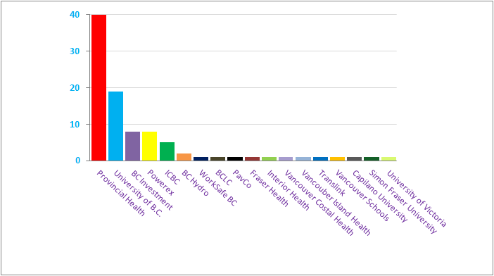
Our fist step begins with advice from one of the fathers of visualization Jacques Bertin. In Semiology of Graphics he states “color exercises an undeniable psychological attraction… It captures and holds attention, multiplies the number of readers, assures better retention of the information and , in short, increases the scope of the message.” To summarize: with color we get more readers for Skelton and increased scope for Few.
Now lets increase our information density by taking those bars and stacking them one atop the other.
That’s more interesting but as you can see it takes up a lot of vertical space. Let’s curl it up into a nice compact ball.
Now lets address all that empty space in the middle that could be used to re-enforce our message.
Filling it in to the center means that now, not only is our data encoded by arc length as it was before, but we’ve also periphastically encoded the data with both the newly created wedge angle and the wedge’s overall area. As Moritz Stefaner notes in On the role of bacon in visualization, “Redundant encoding… is nothing bad per se.” He’s right, and with the change below the redundancy gives us three times the kick.

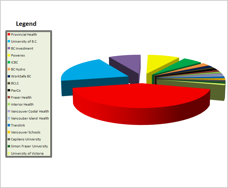
Now, however, we begin to see some clutter which can “obsure the structure present in the data” as outlined in this paper by W. Peng. To put it another way : Words belong on cake, not on pies. We want to have our data at the forefront, not our data labels. Luckily for us there is a perfectly viable solution for untarnishing our pie and its been around since Tufte invented visualization over two-hundred years ago: the Legend.
The strong border and subtle background color of the legend provides us with a visual separation, ensuring we keep our data and its categories differentiated.
We can add further perspicacity to the components of our pie by applying the Japanese concept of Ma. Ma represents space or a pause. It is, as Alan Fletcher describes, “the interval which gives shape to the whole”. By exploding our slices slightly we provide the silences which give our data form.
Our audience is most likely engaged by our graphic at this point, but we want to fully engross them. To do that we must take advantage of the full range of their visual capabilities. Humans perceive in three dimensions, so let’s add some depth to our graphic.
Data Visualizer, Cole Nussbaumer says here that we must show “what is interesting about the visual and give [the] audience a sense of where they should pay attention.” Skelton’s main focus was the overwhelming number of high paid positions in Provincial Health, so we’ll rotate our visual to put that piece center stage and in so doing significantly up its visual prominence.
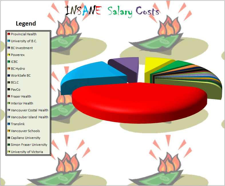
Now we have a good graphic that will pull our audience in. But lets not stop at good. Lets do a proverbial Jim Collins and go from good to great. By giving it a title we further emphasize the message that these salaries are extortionate financial outlays and we buttress that message with a felicitous background image.
The graphic above is print ready. But on the web we can take it a step further and utilize our most powerful pre-attentive attribute. The ability to perceive motion was fundamental to our paleolithic survival as saber tooth tigers ate those of us who didn’t see them coming. By adding motion to our graphic we can capitalize on the base human response to ensure attention is directed where it is most desired.
Few would disagree with the obvious superiority of this new chart. What this makes clear is that with a little extra effort on our part we can turn a vapid visual into a gripping graph.
*Special thanks to Microsoft for putting together this great help file outlining how to create some of these visualization best-practices


Beautiful example!!! Now I know how to maximize oomph, especially with animated gif magic on the pie slices.
Great data viz’s (visae?). I’m going to use exploding 3d pie charts all the time now. Especially for changes in stock prices as a function of time.
“Few would disagree…”
Indeed.
Finally, a worthwhile reason to initiate the opening of my eye lids. This chart is beautiful!
Pingback: Bar charts are boring: a redesign | Stats Chat
If only that last pie chart was scratch’n sniff too…
As any scientist will tell you, pie charts are the worst way to visualize data.
I was confabulating with my scientist confidant Neil deGrasse Tyson and he had this to say about the champion of charts “The good thing about pie charts is that they are true whether or not you believe in them.”