
Back in Jan 2011 CBS produced this classy pie chart, in the wake of the President’s State of the Union speech that year, which boils things down to the essentials.
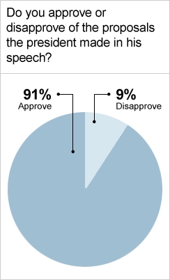
Beyond giving us the necessary pie, it also lays out the values. This clearly explains the math involved in approval ratings, by assuring us that 91% approval results in 9% disapproval. Extra points to CBS for clarity.
But what could CBS have done to make this chart even better? Robert Kosara recently co-authored a paper in which he argues that storytelling and communication of data are the next logical step for visualization. So then, what is the next logical step for the CBS visual? Well by adding some additional information to this chart we can make the story it presents clearer and more robust. Sparklingpicturesofpie kindly put together this edit which provides us with additional context.
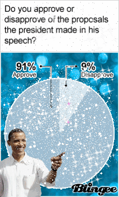
This updated graphic has taken cues from two of America’s storytelling greats. “It begins with character,” say William Faulkner, and this new graphic makes it clear exactly what our main character looks like. Additionally, as Eudora Welty says “Every story would be another story, and unrecognizable if it took up its characters and plot and happened somewhere else.” To that end, with this revision, like with Minard‘s temperature scale, we now have an the additional dimension of weather as executed through a clever use of animation.
Next time you’re making a pie chart consider what you can add to it to make your narrative that much more compelling.