
What better way to start our journey into pie than with the incredibly witty and original idea of making a pie chart with pies. The good folks at degreesearch.org put together this exceptional infographic delving into our pie-eating proclivities.
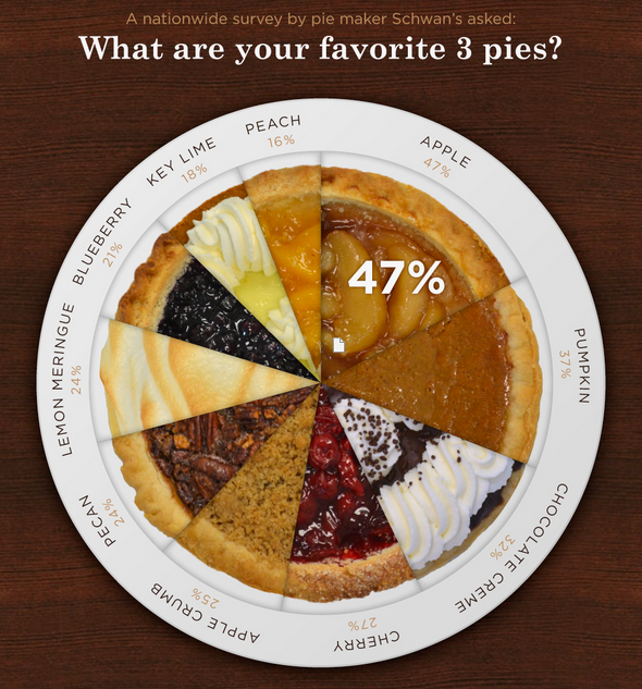
Not only is this chart enticing and delectable, but it also demonstrates one of the most underutilized features of pie charts: their ability to convey two percentages at the same time. Stephen Few states here that one of the characteristics of a graph should be to “Present all the data that is needed for the audience to see and understand what’s meaningful.” This chart makes clear that 47% of American’s list apple as one of their top 3 pies, but beyond that it elucidates how that figure works out to roughly 17.3% of the listed pies. That’s two data points for the meager price of one.
Andy Kirk in his excellent book Data Visualization: a Successful Design Process, talks of how “we are trying to find ways of showing many dimensions of stories within a single display.” The pie chart neatly allows us to convey two dimensions in one easy to read form. When next you make a pie chart, consider whether adding more filling than the standard recipe calls for might further sate your audience’s data cravings.