Ed. note: Big Data requires Big Brains, and as such I am grateful to have collaborated with Scott Murray to bring you this essential essay on the subject. Murray’s experience at the University of San Francisco where he is an Assistant to the Professor of Design makes him uniquely suited to offer equivocal advice on the subject. Murray’s unflappable use of circles in visualization is what initially drew me to his work, but it was the vastness of his mind that lead me to believe he could absorb all the Big Data and, together with me, effectively communicate with and about it. Find Murray on Twitter at @alignedleftover. —E.P.
Telemarketer Clive Humby has said, “data is the new oil.” As the veritable disgorgement of Big Data grows, it seeps evermore deeply into the downy under-layer of our lives. Jer Thorp notes that “everyone in our society is producing vast quantities of data,” and in his article in the Harvard Business Review, he makes it clear that to flourish we must immerse ourselves in its viscous content.
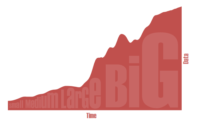
When navigating Big Data’s oleaginous seas, we rely on visualization to reveal its shimmering rainbows of insight. And with Big Data continuing to embiggen (as illustrated below), it is even more imperative that we effectively convey its substance.
Per Edward Tufte, we know “to clarify, add detail… don’t start throwing out information.” As the inexorable embiggening continues to add detail, we must ensure that detail remains visible and accessible for analysis. Fortunately, to address this conundrum, we can again find guidance from Tufte who declares that “much of the history of progress in science and in communication can be written in terms of improvements in resolution.”
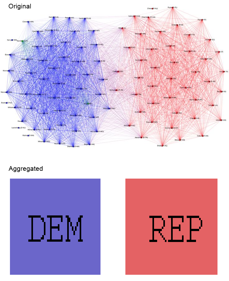
With Big Data, there is a temptation to aggregate values, and display only the derived data in place of the original data set, in all its multivariate glory. (Even we admit to having made this mistake, early in our illustrious careers.) Yet we must resist this urge, for when we obscure detail, we mislead the viewer through oversimplification, as evidenced in the second version of Renzo Lucioni’s voting relationships graph below.
Thus, to have an honest presentation of Big Data without simplification, we require higher resolution output media for representation. Apple’s much-lauded Retina displays provide us with a reasonable 5,184,000 pixels. Assuming that we could effectively represent an arbitrary data set by fully employing every pixel, we are limited to a theoretical maximum of 5,184,000 individual data points.
Below is an image which, if viewed full-screen on a 15-inch Retina display by experts in data display and interpretation (such as ourselves), will provide a mind-boggling exactitude of easily digested insight.

Of course, the vast majority of viewers are not so well-trained in the intricacies of data interpretation. So, as a practical matter, if the visualization’s audience includes any non-experts, we must employ a more accessible visual structure, such as the area chart below.
 In this example, our data-resolution is reduced to the Retina display’s 2,880 vertical columns (even less including margins for axis labels) — a disheartening reduction to a mere 0.05% of our original data density. Just under 3000 values is staggeringly shy of the gigabytes, terabytes and even xylotabytes of information found in Big Data.
So what are we to do? Some propose we continue to rely on the ever-increasing resolution of displays. Yet this approach is not a long-term solution as it embodies two fundamental deficiencies. First, the rate of growth of Big Data is rapidly outpacing the rate of display resolution increase. Big Data is getting Bigger, faster.
Second, and perhaps more troubling, having more, smaller pixels may not be useful in any case, due to the perceptual limitations of the human eye. As Colin Ware points out, thanks to so-called superacuities (not to be confused with “super cuties” or, worse, “super cooties” — we recommend careful enunciation when discussing this subject), “we can resolve about 100 points on the head of a pin.” While this seems impressive, it is not much more dense than current 300ppi resolutions. So, although our many rods and cones give us a profusion of “brain pixels,” as Ware helpfully terms them, a 600 or 1200 ppi display may not be able to take advantage of them.
If swelling resolutions won’t solve our conundrum, we must think outside the box that is our monitors. That is, Big Data requires that we literally think Bigger. Compared to a 15-inch Retina display, an 80-inch TV with 300 ppi resolution is a large improvement, but still not big enough for Big Data. How about a forty-foot movie screen at the same resolution? Still not enough, sorry to say.
So how big is Big enough? Fortunately, someone has already run many of the calculations for us. Let’s consider a display equivalent in size to the amalgamation of every iPhone ever sold, as calculated and mocked up by Josh Orter.

Intuitively, it feels as though we are finally approaching a functional screen size, but even the 330.54 acres of high-res display here isn’t enough. For Big Data, we must go bigger. To go bigger, we must think even further outside the box. Yet no boxes, on Earth or otherwise, are big enough for this critically important problem. In this case we must bend our minds to the problem and look to the heavens. We need to shoot for the moon, so to speak.
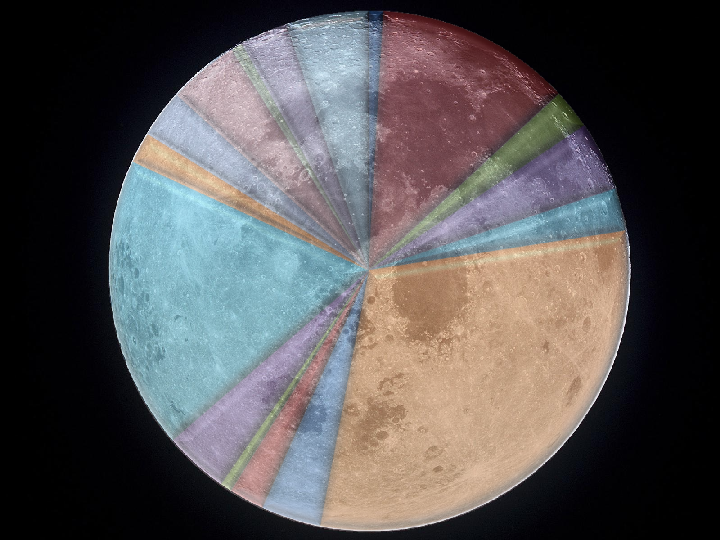
The moon’s visible surface area is 18,965,000 sq. kilometers. By our calculations, at 300 ppi, the moon’s surface, then, could comfortably contain 2,645,622,791,244,000,000,000 pixels. Finally, we have approached a density sufficient to visualize Big Data as long as we uphold Tufte’s core principles by utilizing the entire orbicular display right up to its edges. By employing recent developments in projection mapping, we can adapt our information display to the moon’s surface, creating visual patterns which we’ve termed high-density, data-concentrated, moon-optimized graphical forms (see below). We are wholly confident that these ideal forms, when displayed on the Pixel Intensive Extraterrestrial chart, will become the new standard for the display of Big Data, Bigger Data, and beyond.